What is a candlestick chart? How does it affect the behaviour of investors in the cryptocurrency market? How do you read it and what data can be obtained by studying the main candlestick patterns? We will discuss all this in the article.
Candlestick chart meaning
What’s the meaning of a candlestick chart? Candlestick charting is a technique that allows you to visually display the change in the price of an asset, be it a stock, an entire fund, or a cryptocurrency, over time. The chart, as the name implies, consists of candles, that is, shapes that look like candlesticks and are made up of four points. These 4 points represent the opening price, the closing price, and the highest and lowest prices. Candlestick chart originated in Japan, so in some cases the candlestick chart is called Japanese. Nevertheless, nowadays, such charts are used all over the world, from the Nasdaq exchange to the Forex market, crypto projects, and even the markets of companies creating technology products in Python.
A candlestick chart gives an idea of how the price of, for example, Bitcoin, has changed over a certain period of time. You should remember that cryptocurrency exchanges, unlike “regular” exchanges, operate 24/7. Therefore, the opening and closing prices (most often) mean the price at the beginning and the end of the day. This is taken into account when drawing up a trading strategy for beginners.
How does the candlestick chart work? Explained in details
The chart shows 4 asset prices, thereby allowing you to analyse the behaviour of a security or cryptocurrency in the market. Investors divide candles into two main patterns: bullish and bearish. Bullish patterns indicate that the closing price is higher than the opening price. In turn, bearish patterns demonstrate that the closing price is lower than the opening price. Based on the combination of these candles for several days or several reporting periods, you can understand what is happening with the company. You can see how investors treat its securities, whether they sell this asset, trying to get any amount for it just to get rid of it, or keep it in their portfolio. Graphical tools, which we will discuss later, allow you to track the behaviour of candles from one minute to one month. They serve as a good indicator for tracking market sentiment..
Candlestick chart types: basic formulas
What candlestick chart patterns are currently there? There are a lot of them, and each of them has its own name. We will discuss the main ones — those that traders see most often and will definitely come in handy during asset analysis. You can use them as a Japanese candlestick cheat sheet.
- Hammer
Such a candlestick chart pattern has a short body and a long shadow (it is located at the bottom of the candle). Usually, such a candle shows that the downtrend is approaching its lowest point. In addition, such a position of the candle makes it clear to the investor that investors tried to “push” the price of the asset, to increase it, but the attempts were not really successful. The candle can be green or red; if it is green, then there is an uptrend in the market, if it is red, then there is no such trend yet.
- Inverse hamme
Such a candlestick differs from the ordinary hammer in that instead of a lower shadow, it has an upper shadow. It should be longer than the wick located at the bottom of the candle. In turn, the wick should be very short. Such a model indicates that they tried to “drag” the price down, but the buyers (investors) managed to keep it at the same level or even increase it.
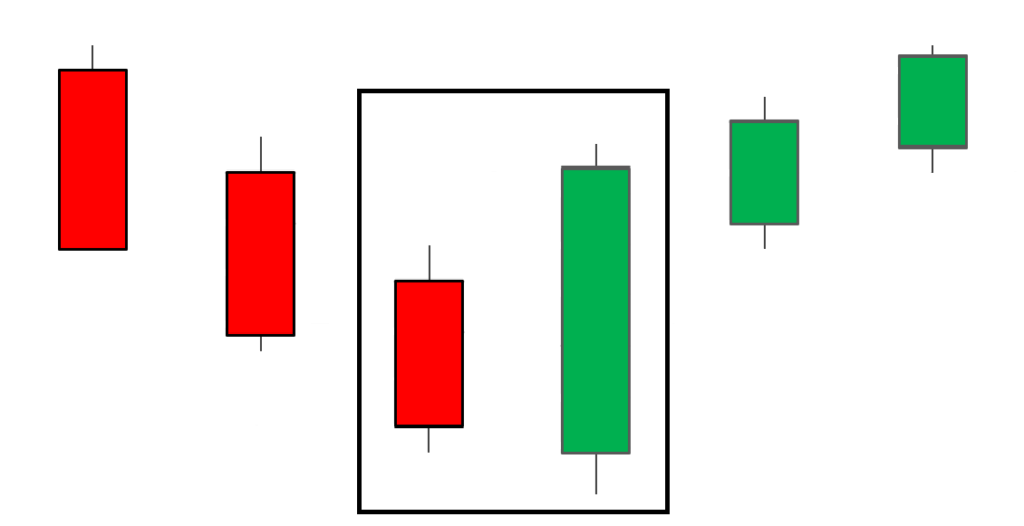
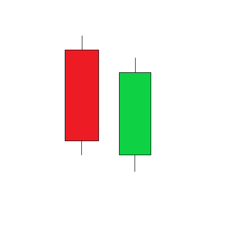
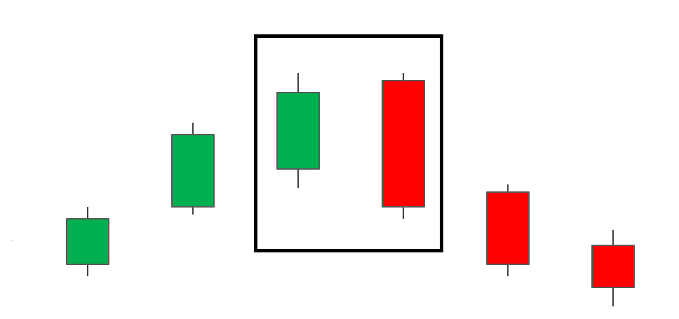
- Bullish engulfing
This is not one, but two candlesticks. The first is short and red, and the second is long and green. The first candle shows the opening price higher than the green one. This is a downtrend reversal in the price of an asset, seen in many Japanese candlestick patterns.
- Piercing line
Here we have two candlesticks signalling a low reading of the downtrend. The first candle is long and red, and the second is long and green. There is a large gap between the closing price of the red candle and the opening price of the green candle: this means that investors are raising the price, trying to profit from the difference between buying and selling.
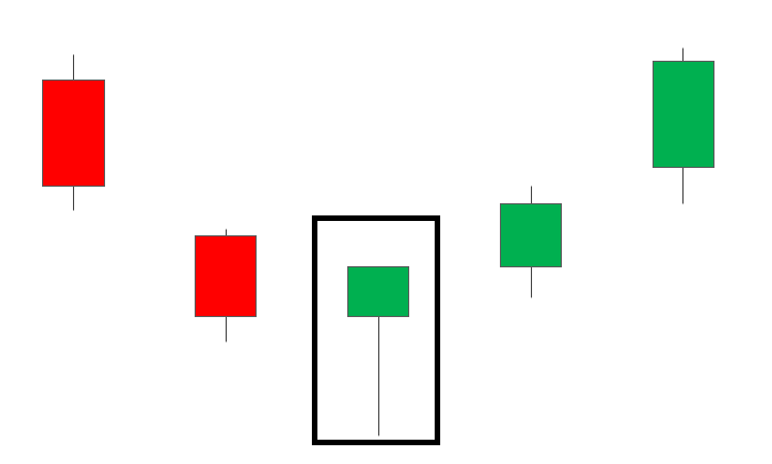
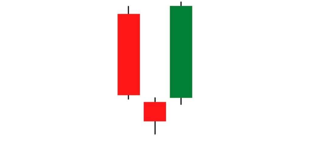
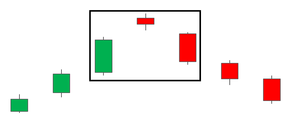
- Morning star
Let's move on to more complex Japanese candlestick charts. The morning star is three candles at once. The first is long and red, the second is short, usually red, and the third is long and green. The middle candle rarely intersects with the two long ones, but sometimes it does. This composition indicates the formation of a market of investors who dictate their own rules for buying and selling on the market.
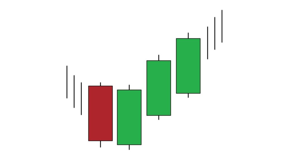
- Three white soldiers
This Japanese candlestick pattern is also known as the Three Advancing White Soldiers pattern. These are three long green candles with small shadows. The opening price of each new candlestick is higher than the opening price of the previous one. This is a sign of a bullish period, that is, the period of investors, showing the exit of the asset from a downtrend.
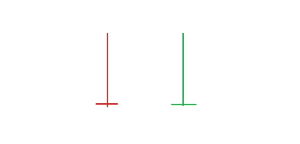
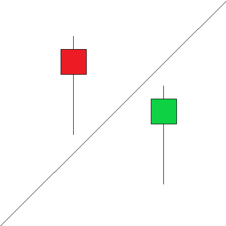
- Doji
This is a candlestick with a very small body and two long shadows. It is considered a harbinger of danger for investors, since it can be both an indicator of a trend continuation and its reversal. So, the doji speaks of investors' indecisiveness, so you shouldn’t see it as an accurate sign of the trend.
Japanese candlestick charting techniques: how do you spot an uptrend reversal?
In this section, we will describe which Japanese candlestick types allow an investor to be sure that an uptrend in asset prices will soon be replaced by a downtrend. So, the list of the most obvious reversal patterns includes::
- Hanging man
This Japanese candlestick charting is essentially an inverted red or green hammer with a short body and a long shadow underneath. A hanging candle shows that the uptrend has come to an end and investors should get ready for a sell-off in assets.
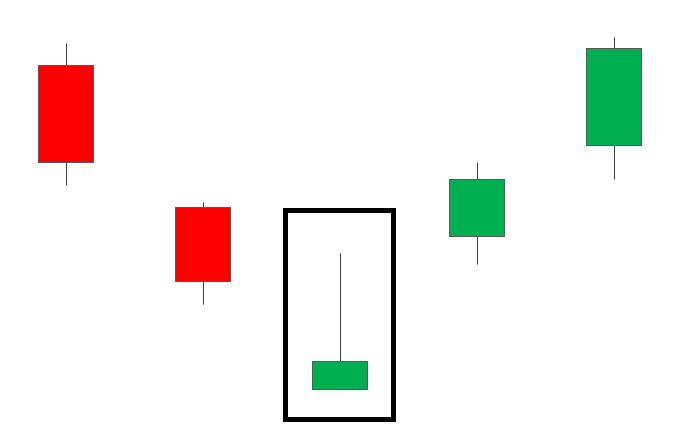
- Shooting star
This is the opposite of the hanging man: a red candlestick with a short body and a long shadow above it. Sometimes, there may be no body: this will indicate that, most likely, the asset will open higher than expected, and will close lower than the opening price.
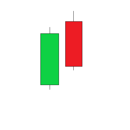
- Bearish engulfing
Remember the bullish engulfing? This term is part of the same story. The first candlestick of the pattern is small and green, and the second is long and red. Engulfing indicates the peak of an uptrend and, most importantly, shows that a price reversal is about to occur. The lower the second candlestick is, the faster this reversal will happen.
- Evening star
This is the reverse version of the morning star we talked about earlier. It consists of the same three candles. The first is long and green, the second is small, more like a cross, usually green, and the third is long and red. It speaks of a trend reversal, which, however, can be interrupted by an increase in the asset price.
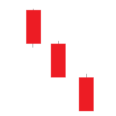
- Three black crows
These are reversed white soldiers. Here we can see three candles, all long and red with short shadows, and sometimes without them at all. With each closing, the price of the asset should decrease, and the opening price may be at approximately the same levels as before.
- Dark cloud cover
This pattern consists of two candles: a red one that opens higher than the green one and closes below the green one's median price, and the green one. This means that prices in the market will slowly go down. However, if the candles have short shadows, then this is a sign of reliance that the fall is about to begin.
How to read a candlestick chart
To be able to read a candlestick stock chart, you need to first understand how it is set up. You can choose the display time — minute, hour, day (trading period, not 24 hours), week, month. You can then select the asset or group of assets you want to track. Some resources allow you to combine charts of several cryptocurrencies to see intersecting trends. We advise you to use them — they are more informative and help not to make mistakes when comparing variables manually. Below you will find a detailed description of the candlestick chart analysis process.
Candlestick chart analysis: how to read a candlestick chart
How do you read a candlestick chart for day trading? What should you pay attention to? Well, let's talk about the technical analysis of candlesticks in more detail. A candle has a body, a wick, a shadow, and a colour. The body is the opening price and the closing price of the asset. The position of the points of the body indicates whether the candle is bullish or bearish — remember, we talked about them at the very beginning of the article? The wick and the shadow are the maximum (for the wick) and the minimum (for the shadow) of the price for the period specified by the investor. If there is no wick, then the price high coincides with the opening price. If there is no shadow, then the price low coincides with the closing price. The wick and the shadow help you see how the mood of investors changed over the course of the day, whether they were rushing around trying to make money on an asset, or calmly considering various offers. When we are to analyse a candlestick chart, we need to understand that, foremost, the colour of the candlestick body indicates the price movement. If the body is white or green (but more often green), then the price goes up. If it's red or black, it's going down. Here we are to note something important: if the body is green, then its upper limit indicates the closing price. If it is red, then you see exactly the opposite. The wick and the shadow can change places, respectively, with changing showings of the limits. That is, the wick can be in the place of the shadow and vice versa. See? Understanding candlestick charts is easier than it looks! For starters, you can write down the shapes that you notice in Excel — this way, you will memorise them faster.
Candlestick chart software
If you want to learn how to analyse charts, try using the following services:
- Google Finance. It offers a simple interface suitable for beginners who have been reading a candlestick chart for a while without really understanding the patterns. Unfortunately, this site does not have an app, which makes it difficult to work with it from a smartphone.
- BigCharts. It is a good way to train for a trader who already knows the main technicals and has memorised the main metrics of a market trend reversal. Here you can track changes in candlesticks live and share your developments. It’s free!
- TradingView. The service was created as though specifically for traders who make money on cryptocurrencies and track the behaviour of assets throughout the day. There, you can also find several comprehensible candlestick chart cheat sheets.
Candlestick vs line chart
Which is easier to use: a regular chart or a candlestick chart? Experts agree that candlesticks are a more convenient tool, suitable for both experienced traders and beginners who are just starting in the cryptocurrency market and learning patterns. Why is that? It's simple: a line chart shows either the opening price or the closing price (this is the figure that is most often displayed, but it all depends on the programme you use, or the exchange on which you trade assets. Sometimes, a line chart is even available in Google Sheets). The candlestick chart gives a wider insight into the behaviour of the cryptocurrency, which works in the favour of an investor who wants to make money on blockchain coins. Only candlesticks can predict the trend emerging in the market! So, using them will drive any owner of cryptocurrency assets to success.